Xbox Series X Logo Seemingly Revealed
- Thread starter Jawmuncher
- Start date
You are using an out of date browser. It may not display this or other websites correctly.
You should upgrade or use an alternative browser.
You should upgrade or use an alternative browser.
Just some more fan art thought it looked cool


This is the way to use it. Looks fitting.
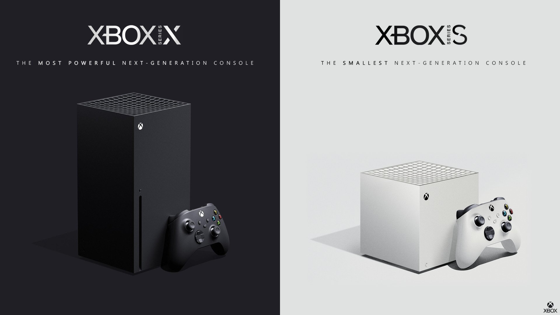
These look great, though I have to make a bit of effort trying not to read XBOXIX and XBOXIS. I can see them going this route, though stating that some padding must be left between console model and brand.
These look great, though I have to make a bit of effort trying not to read XBOXIX and XBOXIS. I can see them going this route, though stating that some padding must be left between console model and brand.
Yeah true
I also really like the idea of it being under the Xbox family logo instead of right next to it.
Because the small text series does actually look like an I.
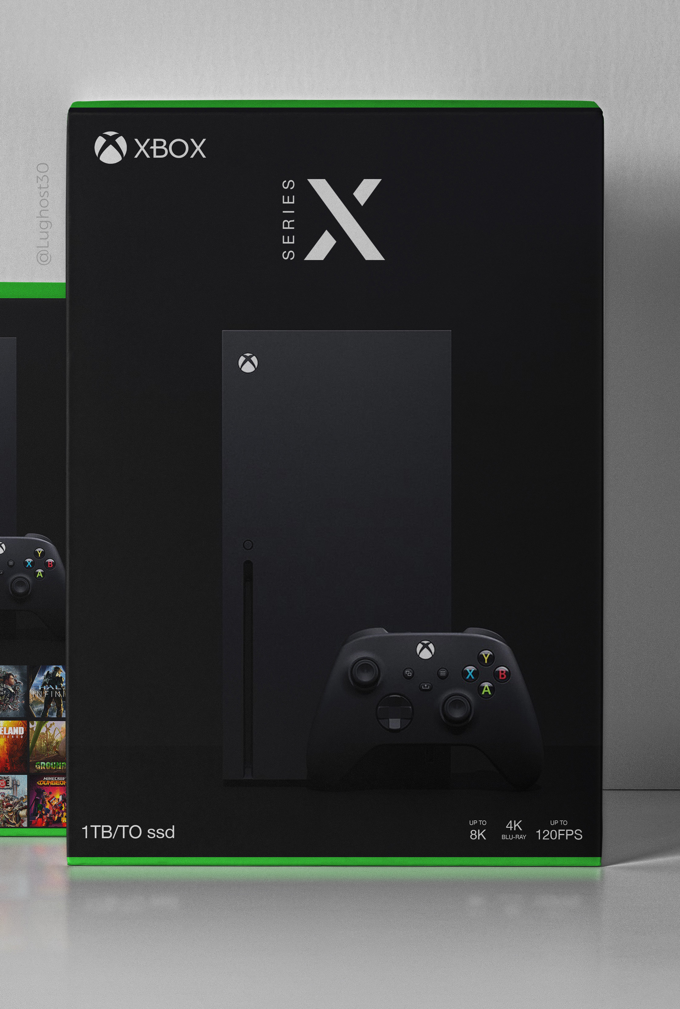
Lughost30 made some really cool concepts for packaging. ^^
They look so premium im now more sold on the minimalist look im fully on board.
Why try hard when you got this.
All your favorite brands and powerful companies have minimalistic logos why people were expecting somthing super elaborate is beyond me.
Not what I was asking.
Im just curious if you are speaking in hyperbole and whether the X in the One X was also ugly in your opinion.
Changing cahnging said opinion isnt really my place or concern.
No hyperbole in "ugly logo".
Ugly?

Out of curiosity what would constitute a good logo then?
IF this is outright ugly, i dont want to guess what some of the monstrosities out there get rated as.
So yeah what do you think is a good logo?
Ugly?
Out of curiosity what would constitute a good logo then?
IF this is outright ugly, i dont want to guess what some of the monstrosities out there get rated as.
So yeah what do you think is a good logo?
Yes, ugly.
I'm not a graphic designer, I don't know what would constitute a good logo, I do know what I find appealing. This logo is not it.
A logo I think is good is the Switch logo.
okay i read the whole thread and i'm really not understanding the drama here. every time someone points out that this is most likely a compatibility signifier designed for the back of the box or the top right of the front and not taking over the actual X orb logo they get ignored and people go back to comparing the two or locking them up together? i don't know. it's fine. you're probably never going to see it if you don't buy physical games and this being turned into news outside of any sort of context is kind of a reach / an invitation for console LOGO wars which i didn't even know could be a thing

It looks like XBOXIX.
Xbox 9.
GG Sony now YOU are not just 1 generation behind but 4!
if some how not obvious this is a joke.
I honestly don't think it moves the needle one way or the other, which is the mark of a good logo to me. It feels like they focus group tested it 500 times and this is the one that just didn't move the needle for anyone so they took itIt's really ugly, but I doubt it'd matter in the grand scheme of things. It'll be interesting to see the disk packaging, not sure how they'll mix the green and black.
Really? I'd strongly argue that being bold and striking for a company that is looking to reverse the mindshare is far more important than being bland and outdated. Like I said, it won't make much difference, but it's not exactly going to grab people.I honestly don't think it moves the needle one way or the other, which is the mark of a good logo to me. It feels like they focus group tested it 500 times and this is the one that just didn't move the needle for anyone so they took it
The ps5 logo is literally the same logo as ps4 again. It doesn't matter at all, so long as it isn't grotesque. This isn't thatReally? I'd strongly argue that being bold and striking for a company that is looking to reverse the mindshare is far more important than being bland and outdated. Like I said, it won't make much difference, but it's not exactly going to grab people.
Saw this yesterday on Twitter and yeah it's an extremely ugly logo. It looks incomplete or something.
The PS5 is very much on top right now, changing the logo too much could be a bad thing in terms of retaining mindshare. MS is the opposite.The ps5 logo is literally the same logo as ps4 again. It doesn't matter at all, so long as it isn't grotesque. This isn't that
But again, it matters little in the long run.
It's the same logo as the ps3 slim. There's no change other than a numberThe ps5 logo is literally the same logo as ps4 again. It doesn't matter at all, so long as it isn't grotesque. This isn't that
Depending on how this is used. All they ended up doing is making 'SERIES' turn sideways and make some mods to the X.
The "X" use isn't new. It's the same general design they used for the One X
The "X" use isn't new. It's the same general design they used for the One X
no mindshare can be won on a logo. I promise uThe PS5 is very much on top right now, changing the logo too much could be a bad thing in terms of retaining mindshare. MS is the opposite.
But again, it matters little in the long run.
That's... literally what I just said...
Looks ugly and expensive for me.
I agree. There really needs to be some space between the word Xbox and Series X.
Really? I'd strongly argue that being bold and striking for a company that is looking to reverse the mindshare is far more important than being bland and outdated. Like I said, it won't make much difference, but it's not exactly going to grab people.
the best logos are the most recognizable. Lots of folks here calling it ugly and bland don't seem to grasp that its objectively not ugly and just about every logo for every big company is 2-3 colors and simplistic.